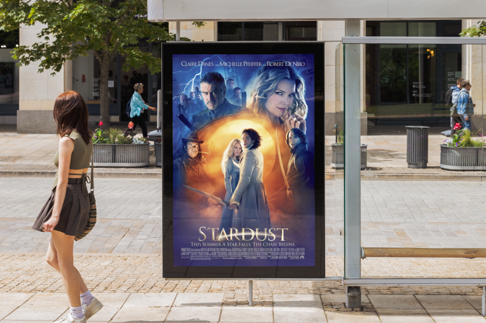
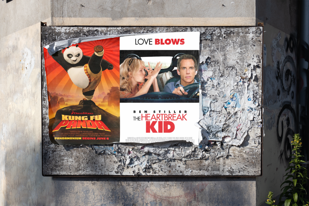
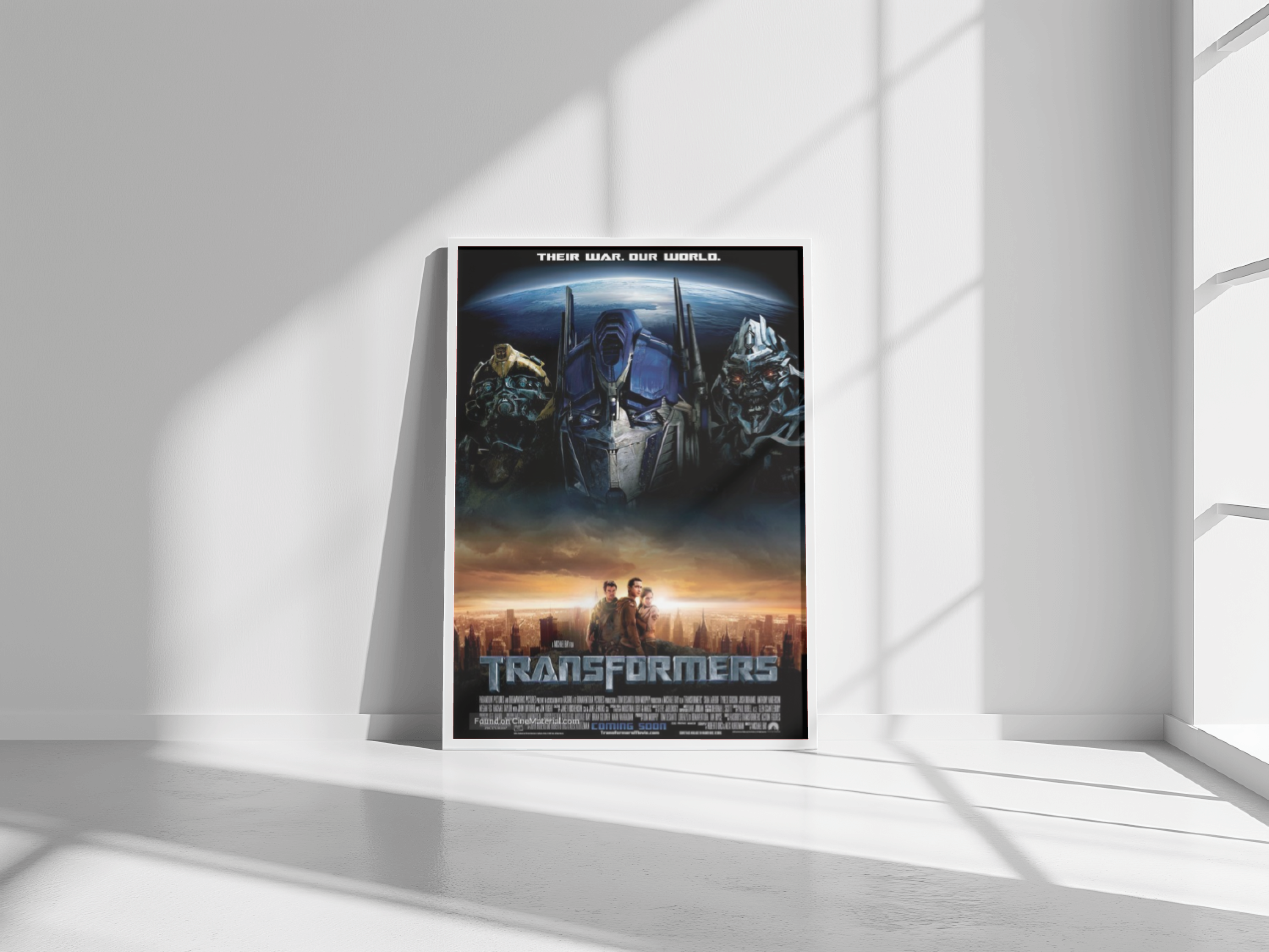
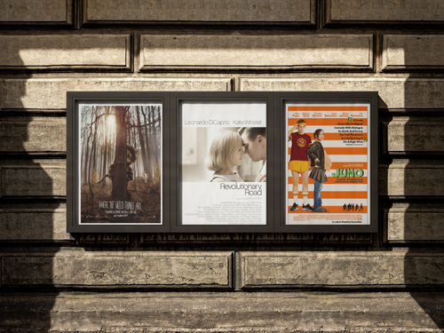
I spent an amazing 3 months learning the ins and outs of designing Theatrical posters at BLT Communications. They are a 100% employee-owned creative agency focused on Entertainment Marketing.
tl;dr
- Learned the ins and outs of designing Theatrical posters with Photoshop.
- Realised I really want to design interactive solutions that solve problems for end-users

The project
I was working on my Master's Thesis back then and I needed some help from a subject matter expert. I was writing about "Lighting effects in 3D environments", and focused primarily on the added value of spending more money on more advanced lighting effects. When does it have added value and when can someone get away with doing less?
At BLT Communications I had the privilege to talk to such a 3D artist and at the same time I was part of one of the teams that created compositions for movie posters and other Entertainment Marketing material.


Highlight
Apart from a crash course in retouching, masking and the use of brushes in Photoshop, I really enjoyed going through images of the photoshoots and picking out the right ones that would fit the vibe of the message we wanted to send. It was always about finding the right balance between the script, the opinions of the studio, the producer, the director, the actor or actress and the message we wanted to convey to the audience we wanted to attract.
Lessons learned
- Photoshop. No, but really...
- God is in the detail.

